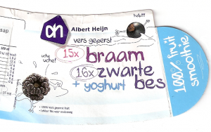
Packaging of Albert Heijn's black berry smoothie
The Dutch super market chain Albert Heijn actively follows the “health” trend by selling healthy snacks. I recently bought a bag of Parisian carrots and a black berry smoothie in the AH to Go at a Dutch train station. The following train ride gave me some time and opportunity to have a look at the packaging of the smoothie. Although I would expect the healthy product to radiate optimism and good feeling, I was surprised to see the image on the right.
The image shows a description of what kinds of fruit are in the smoothie and next to it some very unhappy fruits! One seems to be drowning, shouting “help!!!”. The other is coughing (“uche uche!”). Not really what I would like to accociate with the food I consume… This could be an attempt to make the packaging less boring or even funny, but I fail to see how exactly. The rest of the packaging does not communicate anything funny and is indeed boring. I would like to know the impact of these cartoons on the overall image of the product. Do people find it funny? Do they feel happy about consuming fruit that was ‘sacrificed’ for their smoothie? (Is that the reason the fruits are screaming?) Do consumers accociate the product with (un)healthiness? And more in general: is it wise to associate products with negative expressions?